
LifeSource unveils refreshed identity with new logo and tagline
We’re excited to share our refreshed identity, including a new logo, colors and tagline that reflect who we are and how we serve our community.
LifeSource operates as experts in a unique area of healthcare that not many will intersect. Organ donation is incredibly rare; while nearly 60% of people in our community are registered donors, only a small percent may be directly involved in the process. Our updated brand provides new opportunities to establish stronger emotional connections to the work that goes into managing the donation process and strengthens peoples’ positive perceptions about donation and LifeSource’s role as an engaged community member and partner.
Why the change?
As we have grown and evolved over the last few decades since our last logo was designed, we saw the need to update our visual identity to better reflect the maturity of our brand and the vibrancy of the team that fuels its success. The new logo centers the heart as an essential driver for how we approach every relationship, how we solve every challenge and how we inform every aspect of our work.
Brand identity reimagined: What’s new?
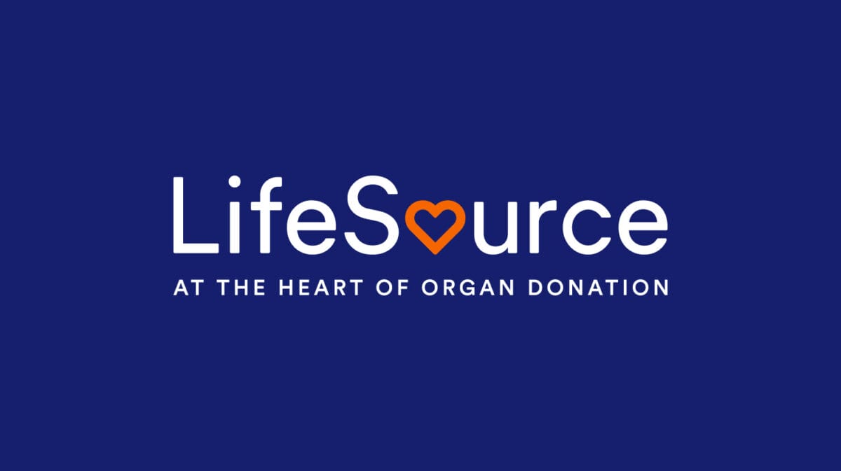
New logo: The new logo uses more timeless typography and an updated color scheme that better represents the value of our expertise and community-centered approach to our actions. The letter “o” is intentionally transformed into an orange heart to emphasize the symbolic aspects of organ donation and the role LifeSource plays as a bridge in the donation process between donors, their families and transplant recipients. It’s not about what we do; it’s about how we do it – with heart.

New colors: Our new primary colors are navy blue and orange. The deep blue represents LifeSource’s history, authority and expertise in the field of organ donation and transplantation. It evokes strength and confidence in our ability to provide these essential services in the past, present and future. The warm orange serves as a signifier of our team’s dedication to the mission of donation and the respect, empathy and care we bring to the work 24/7/365. Most importantly, the orange heart represents the selfless gift of every donor and their families who have prioritized donation as part of their legacy, and the nearly 60% of people in our communities who are registered donors, committing to saving lives in the future.

New tagline: “At the heart of organ donation” allows people to understand and relate to our work on a human level and the unique role we play in the donation process. The new tagline transcends the technicalities of the process and delves into the emotional resonance of generosity and transformation. “At the heart of organ donation” embodies the essence of donation and it celebrates the efforts and compassion of everyone who is part of this life-saving event.
The shift from “organ, eye and tissue donation” to “At the heart of organ donation” is more than a linguistic change. It’s about conveying identity and purpose, more succinctly transforming the tagline from a category descriptor to a powerful driver for success, connections and impact.
With the launch of our new brand identity, we are bringing our goals and vision forward – taking bolder steps to fulfill our mission and inviting our community to join us on our journey to save and heal lives through organ, eye and tissue donation. After all, at the heart of organ donation lies the essence of humanity — the willingness to give, to heal, and to connect.
Our Thanks
LifeSource is grateful for the talents and energy of the 5IVE team, who recreated our brand. Their thoughtful and collaborative process worked to understand our organization while maintaining the perspective of the outside audiences we want to engage with.
5IVE’s CEO, Boriana Strzok had this to share about the experience:
“The passionate team at LifeSource and the work they do to save and heal lives on a daily basis was one of the biggest inspirations behind the new brand identity design. Managing the complexity of the donation process and supporting the families involved in it requires deep respect, expertise, dedication and lots of heart. Our goal was to bring simplicity to the font and use color contrast and visual balance to highlight the symbolic power behind the act of donation and everyone working to honor the wishes of donors and their loved ones. The final result is a modernized brand with institutional authority, timeless relevance and a shared purpose that easily connects people, medical professionals and the community with their individual and collective love for humanity.”
Thank you for your partnership in creating something new, by using both head and heart.